Impact
Transforming the FoodTech experience in Nepal.
Developed a Unique and Meaningful Brand Identity.
Services
Branding
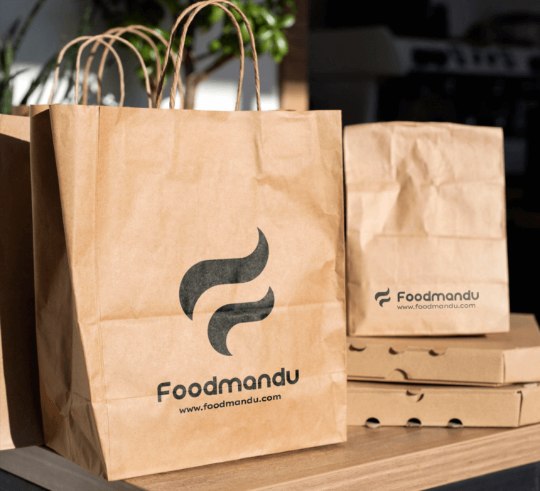
We successfully created a completely new and distinct identity for Foodmandu that represents its history of pioneering new ideas. Our goal was to reflect the beginning of Foodmandu's new era with a fun, brighter, and friendlier approach to its visual identity.
The new Foodmandu logo incorporates two wavy steam streaks that come together to make the letter "F." The steam graphics in the logo depict the joy that users experience when eating hot, delicious food. Before deciding on the brand color, we created a brand strategy, which functions as the baseline for all design decisions. Part of that strategy was to conduct research on the entire industry that the brand is in, how it communicates, what it looks like, and how the customers want to look at the brand. We chose Yellow as the main brand color as it represents enthusiasm, happiness, cheerfulness, and fun, all things Foodmandu deem necessary in their relationship with the customers.
After the brand workshop, we found that there are fairly mixed opinions regarding the core brand attributes of Foodmandu. However, there were a few attributes that everybody seemed to agree upon.
So based on those attributes we have outlined two different directions to construct the new brand Identity of Foodmandu.


